When designing for screens (or designing anything really), there are right colours and then there are wrong colours. Even though the "right" colour for a brand may be…say…red, it's hard to observe the colourless design at hand and say: "Yep, this brand and their website needs to use red as their primary colour".
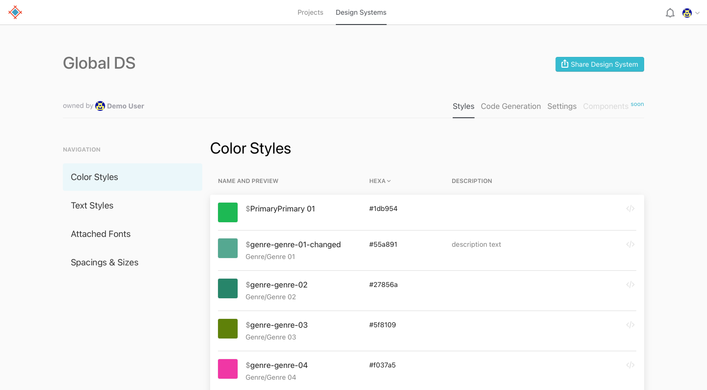
Which is why we tend to use colour scheme generators to speed up the design process. Not to choose the colours for us (that would be too easy!), but to inspire us. As a result, we will end up with a style guide that you hand off together with the rest of the project so everyone down the line keeps the same carefully chosen colours. You can even use Sympli Handoff to deliver your styleguides and your color tokens from your Design System too.
It's commonly thought, that colors affect emotions, though it's not entierly true. It doesn't work like red means love, academic studies show that all three color values: hue, saturation and brightness -- affect people's exitement, not emotion. Brighter colors, for example, cause more exitement than dull ones. Then, personal associations kick in, and they can be very strong and culturally mandated. If we see red and pink banner around Valentines Day - we know where this is going.
As designers we use color combinations and colors in context to tell a story and guide user's attention and experience, using color pallets that we craft that they have more "calm" and more "active" colors.
What makes a terrific colour palette app is one that allows us to tweak the schemes to suit the design we're working on, something that goes far beyond a visually appealing list of trendy "flat design" colours. Let's take a look at 5 of the best app for color schemes.
1. Coolors
Link: Coolors
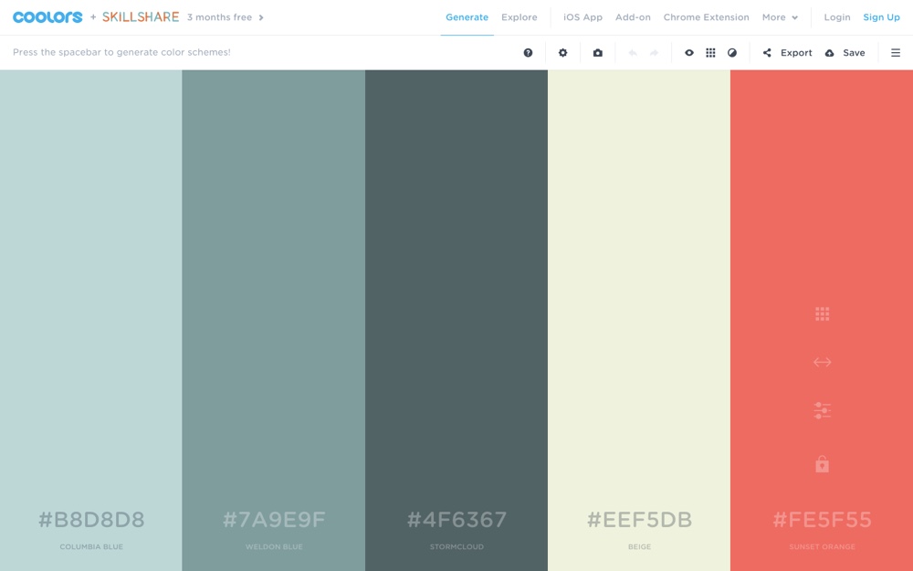
Coolors is my first thought for colour scheme app, as not only can you rapidly cycle through beautiful colour schemes with the space bar, but you can customize them to your liking by tweaking the hue, brightness, saturation, and temperature, and by toggling alternative shades. Plus, with the ability to save/export colours, and use a range of filters that help you cater to the eight different types of colour blindness, this tool becomes massively useful without being too difficult to use. You can also browse trending color palettes to see what is popular among fellow designers.
Pros: there's an iOS version, a Chrome extension, and even an add-on for Photoshop and Illustrator.
Palettr
Link: Palettr
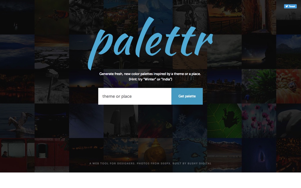
Palettr is a very interesting color scheme app. Let's say that you have a vague idea in mind of what colours you'd want to use, but you need a little inspiration. What do your colours make you think of? A beach…so…yellows and blues? A city street…greys and blacks? Now, this won't work in all cases, but if there's a specific keyword that comes to mind, search for it on Palettr and they'll locate images from 500px.com using that keyword, and extract the common colours from it!
Pros: An unusual way of finding palette ideas, that you can use to jumpstart your thinking process.
3. Color Palette Generator by Canva
Link: Color Palette Generator by Canva
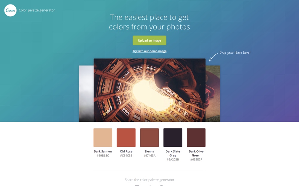
Color Palette Generator is a small web-app built by the talented Canva team that extracts common colours from images that you've uploaded, so if you have a design where the imagery/photography has already been decided and you're building colour schemes upon that (or you simply love the colours in the image), Color Palette Generator by Canva would be a very ideal solution.
Pros: Creating a palette from you image can be a faster way to build design around the images.
4. Adobe Color Wheel
Link: Adobe Color Wheel
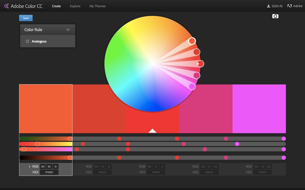
Adobe Color Wheel, although not the most visually appealing of interfaces, offers a more professional toolset for colour mixing. If you know your analogous colours from your compound, complementary and triad colours, then this is the tool for you. Plus, if you're lover of other Adobe apps such as Illustrator, Photoshop, Brackets.io (Adobe's secret open-source code editor) and Adobe XD, you'll find that they seamlessly and awesomely integrate with Adobe Color CC.
Pros: community-made colour schemes.
5. Colordot
Link: Colordot
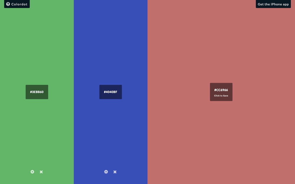
Colordot is for those that really know their colours, or can identify the colour they're looking for when they see it. With every move of the mouse, a new colour is displayed on the screen, along with its hex code (most colour scheme apps let you change this default setting if you're using RGBA though). Think: a huge interactive colour picker where you have full control! When you click (to select the colour), the screen is then split in half, displaying your chosen colour on one side and a new colour picker on the other side. Rinse and repeat until you have all of your colours, or select similar colours to compare them!
Pros: More control over your colors, since you pick them yourself.
Cons: It is manual, so if you're looking for a fast automated way - choose another one from our list.
Importance of Color Contrast
Something that you must think about when choosing colour schemes colours is how well they contrast with the other colours you're using, most notably how the text contrasts with the background. Well-contrasted text will boost the legibility and readability, and ultimately the accessibility of the layout.
Keep in mind, that the colours you use have to pass Web Contetnt Accessibility Guidelines (WCAG) to make your design usable for everyone, both in light and dark themes.
One app that I love using is the Color Contrast Analyser for Windows and MacOS, which compares the colour contrast between two elements chosen by you and gives the ratio a pass or fail WCAG rating.
While this is a stand-alone app, there is a Color Contrast Analyser Plugin for Sketch, as mentioned in in our 5 Smashing Sketch Plugins article.
Handoff your colour schemes and style guides with Sympli
You’ve created your app UI using an amazing colour scheme, but how to make sure the developer on your team knows all about it? Use Sympli Handoff's Brandbooks!
Our Brandbooks are the tool to control your colour palettes style guide. It allows you to define colours and fonts used in your project, and developers can refer to these Brandbooks to make note of the colours used or download the fonts.
Are there any missing from this list that are aiding the colour choosing process in new, exiting and better ways? Let us know!
