
Websites are evolving, have you noticed? Let's take Figma, or Atomic.io, or Gravit Designer for example—would you have ever thought (even 5 years ago) that we'd be using complex design apps in the web browser? We weren't really using the term "web application" 10 years ago, but it's commonplace nowadays.
When web technology evolves, so do websites, both in terms of design and functionality (or form and function, as the saying goes). So, let's take a look at how CSS has evolved in recent years, what CSS properties we need to be aware of, and how they're coming along in terms of cross-browser support.
1. Feature Queries
- What feature queries do: detect browser support
- Why we should use feature queries: to see if certain CSS features can be implemented, and if a fallback is required
- Browser support: CSS feature queries do not work in Internet Explorer
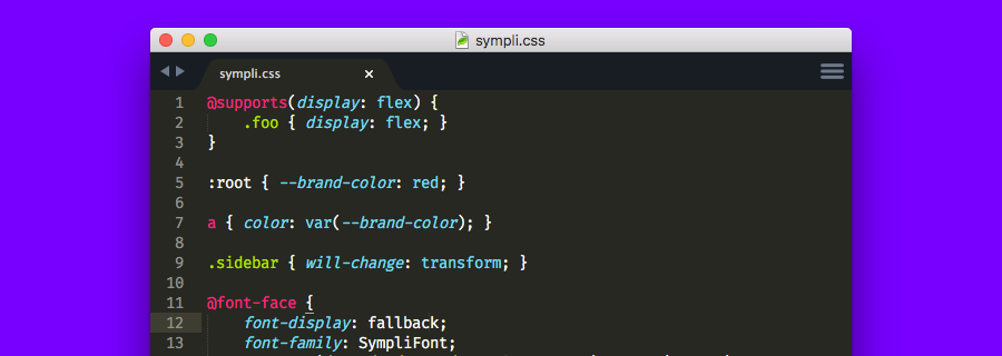
@supports(display:flex) {
	.foo { display:flex; }
}
In the code snippet above, @supports() checks to see if display:flex is supported by the web browser, and if it is, then it styles .foo. Additionally, we could also use not(display:flex) to account for the exact opposite.
2. font-display:
- What
font-displaydoes: defines what happens while custom fonts are loading (display empty space, fallback font, …) - Why you should use
font-display: improves PP (Perceived Performance) - Browser support: only works in the most recent version of Chrome and upcoming version of Opera, however its usage will not break anything (you have nothing to lose by using
font-display:)
Perceived Performance is important, maybe even more so than actual loading times. If a website even appears to be slow, the visitor will grow impatient very quickly and hit the back button. Since custom web fonts can take some time to download, the user is usually left with a blank space and unable to digest the content on the webpage (this is called FOIT—Flash of Invisible Text).
font-display: lets you change that.
:auto: shows nothing until the custom font is loaded:swap: fallback is shown until the custom font is loaded:fallback: if the custom font is not loaded after 100ms, the fallback font is shown instead:optional: like:fallback, but the browser may decide to give up if the custom font is taking too long to download
3. CSS Variables
- What CSS variables do: declare custom variables in CSS
- Why we should use CSS variables: makes CSS theming easier
- Browser support: does not work in Opera Mini, and does not work in Internet Explorer/Microsoft Edge without prefixing
CSS variables are declared inside :root { } brackets. Each variable begins with two dashes, then the variable name, which can also include dashes (for example --brand-color:). We then declare an ordinary property value as the value.
so, instead of declaring the property value in the CSS document as normal, we'd declare this CSS variable instead—this means we can change a common style sitewide using a single line of CSS, rather than having to do a find/replace command, which is similar to the way that pre-processors work, except that CSS variables work natively (and is therefore faster). Bye LESS, bye SASS!
:root {
  --brand-color: red;
}

a { color: var(--brand-color); }
We can even change the value of this variable dynamically using JavaScript, using a code snippet similar to the one below:
const rootEl = document.documentElement;
rootEl.style.setProperty('--brand-color', 'blue');
4. will-change:
- What
will-change:does: prepares the web browser for an element that is likely to change in some way later on - Why we should use
will-change:: stops animation flickering - Browser support: works in most major browsers (not IE or Microsoft Edge)
When a transition or animation happens, the web browser has to "repaint" the display as the animated object transitions across the screen. With complex animations, this can result in laggy performance or even animation flickering.
Which isn't pretty.
will-change: literally says to the web browser: "hey, I'm going to transform into [this] later on, and [this] is how I'll look". And this way, the web browser will know beforehand about the change and there will be no animation lag/flickering.
Accepted values:
:auto: standard optimisations are applied:scroll-position: declares that the element is off-screen:contents: the contents of said element are expected to change, so the element should not be cached by the web browser:opacity, transform, …: CSS properties that may change
Note: will-change: "absorbs" any performance lag by preparing for the animation beforehand, so overuse of it may result in an adverse affect on web perf.
Conclusion
HTML and CSS standards take forever to actually become standardised on the web, and when they do, gaining cross-browser support can be a long, excruciating process. That being said, these four new(ish) CSS features are starting to become widely adopted by the modern web browsers we use today, with the exception of maybe font-display:. But even then, the majority of these CSS features can be used safely (as in, we can use them and they won't break anything, but we'll reap the benefits late down the line when they're supported).